Why Box Art Matters
- Posted on
- By Fair Game
- 0
When you walk into a Fair Game location to buy something new, it is usually for one of two reasons: you have a specific game in mind that you want to buy; or, you just know you want something but are not sure what.
For the first option, we make things really easy for you. Areas in our stores are helpfully labeled with different categories and our expert employees can quickly point you to the right direction to find what you need.
Yet if you are just browsing for something new, it can sometimes be hard to find something that might be a good fit without spending a lot of time picking up boxes and putting them back. There are hundreds of titles vying for attention, so how do you know which ones might be worth a deeper look? I mean, you can’t possibly pick up every box, can you? Well, sure you could, but you may as well grab a nametag and help stock the shelves too if you are going to be there that long.
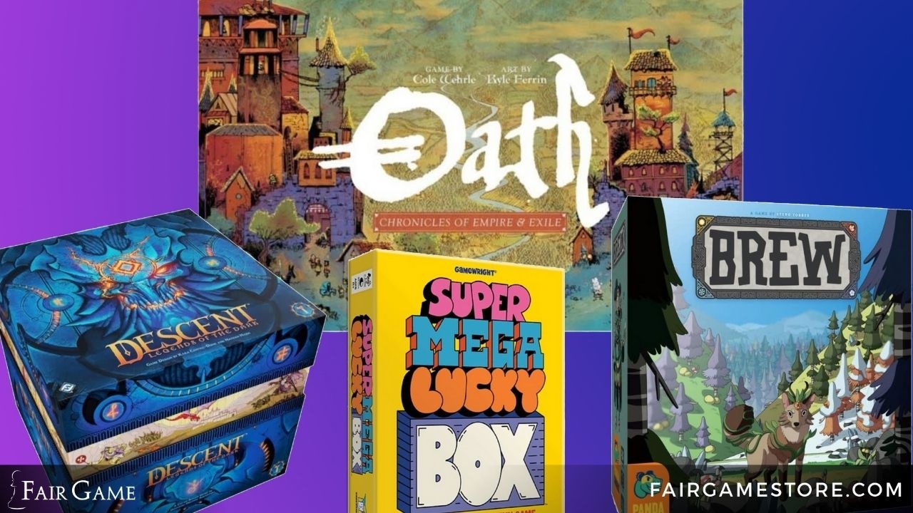
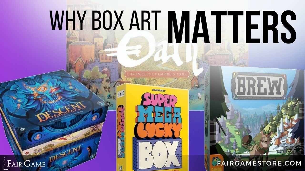
First off, the graphic design and artwork of the box is probably the number one thing that will attract your attention. There's a lot of visual noise on a shelf full of games; only the games with the most striking art and design will stand out from the crowd. This is likely a factor in Wingspan's success as one of the biggest board games of the past several years, and frequently the games we get asked about have the most eye-catching boxes, like Dinosaur World, Brew, Oath, and Descent.
Did you know that many times the art on the cover of the box can give you a hint as to what the gameplay might be like? It’s true! There are lots of aspects about a game that its cover can subtly convey, and understanding those makes your shopping experience better. Let's discuss a few broad examples of board game boxes and how they might help you quickly realize if a game might be a good fit for you.
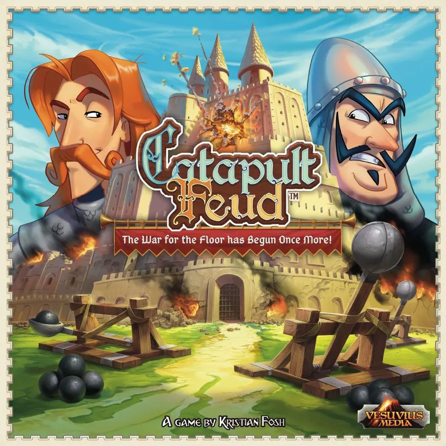
First, let’s talk about age range. Even at a quick glance you can sometimes tell if this game is for adults or families. Let’s compare two games with the same theme: Catapult Feud vs Stronghold: Second Edition. Both games are about a siege—trying to break down the walls of a castle. Looking at the box cover for Catapult Feud, it’s obvious that this isn’t a serious, “thinky” game. The focus of the cover is on two big catapults throwing boulders at a giant castle flanked by cartoonish soldiers (each with an exaggerated mustache) smirking at each other. The art is also softer and has an almost cheery feeling. That bright blue sky makes you think of a warm summer day. All this together takes the feeling from serious to silly pretty quickly (as does the “war for the floor tagline”).
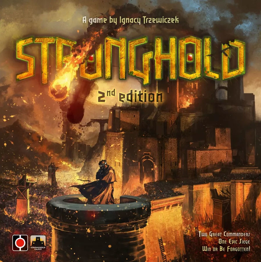
And now look at Stronghold. It is actually a similar image—a castle inflames being hit by siege weapons. Yet the mood is much more somber. The single person on the cover has his head down, face in shadow. Gone is the pleasant summer day, replace by a sky filled with smoke and ash. This feels more like a gritty game about survival then an energetic dexterity game. So, if these two boxes were right next to each other on a shelf, which would you grab first to play with your young ones?
When shopping for a war game, there are plenty of routes you can go. You can look to the box cover to glean a hint as to how complex or serious the game is. For this example, let us take a look at a box cover from GMT, a well-known war game publisher whose titles usually involve deep rules and lots of tiny chits on a map. These covers (Commands & Colors is a good example) try and illustrate the serious, realistic nature of their games. They usually depict a historic figure or vehicle, drawn up in an oil painting or other artistic style that might have come out of the renaissance period.
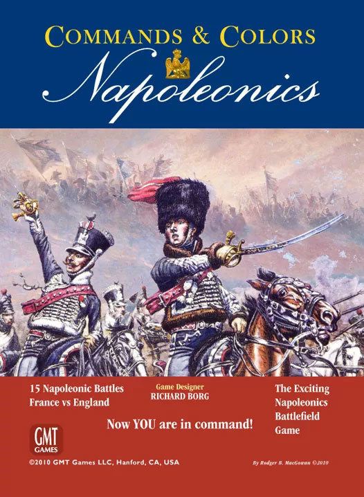
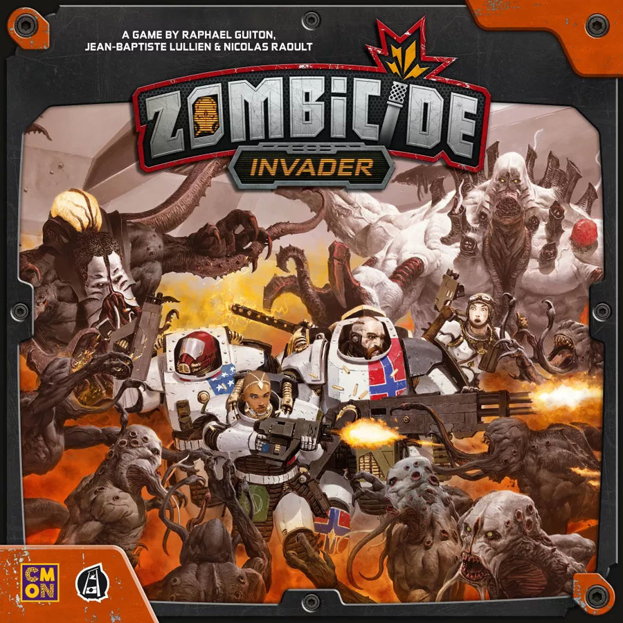
Contrast this with dice chucking, “dudes on a map” games. Something like Zombicide: Invader features futuristic soldiers (definitely not Space Marines, right?) engaged in a heated battle with scary looking aliens. Action is the name of the game here, you are in the heart of the battle. The cover from Commands & Colors makes you feel like a battlefield general, while Zombicide Invader makes you feel like a grunt on the ground floor of the action, with bullets almost whizzing by your head. And for the most part, both of those feelings are spot on with the game play.
Finally, I do want to caveat this by saying that these aren’t hard and fast rules, more of general guidelines. There are plenty of ways a publisher could potentially go the opposite direction when creating a game. Regardless, if you are looking for a way to quickly narrow down your choices a little bit, giving the box cover a deeper look might be the best place to start.

Comments
Be the first to comment...